the project scope
New Logo Suite and Brand Colors
Custom Squarespace Website Design
Brand Toolkit for Type, Illustrations, & Patterns
the creative direction
Sophisticated
Calm
Inspired by Nature
Paragon Coaching Group
Brand Strategy, Identity & Website Design
About Paragon’s Founder
Coleen McCray is an executive coach with a passion for developing emerging leaders and assisting seasoned leaders in path formation to their goals . Coleen’s envisions a new brand and website that is beautiful, encouraging and sophisticatedly genteel. We began by adopting the best elements of her current logo and language, and built an entirely new brand for her fresh new coaching practice.
Coleen’s Goals:
Inspired by the colors of nature and the ocean, and the sense of well-being and calm that it evokes, Coleen wanted to infuse her brand with the colors and imagery that would reflect this. Working with predominantly professionals ages 30-60, Coleen needed a brand that would be inviting and elegant, yet still reflect an undated corporate vibe.
We began with a refresh of Coleen’s current logo, shown here. While this design is professional, graphically pleasing and expertly rendered, Coleen’s desire for a softer, lighter feel begged an update to this mark.

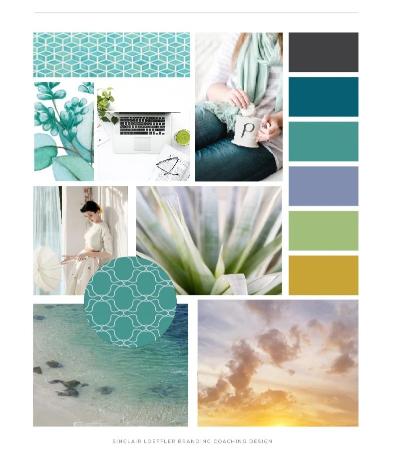
I built three brand boards that each reflect Coleen’s goals in slightly different ways. These mood boards were hands-down some of my favorites to create! The color palette is calm and beautiful, utilizing hues inspired by nature and the ocean.
The Brand Objective
The colors, mostly in shades of blue and green, will add to calming and inviting feeling to the brand. Coleen also wanted her brand personality to be “bright and vibrant,” so we included a cheerful gold and a touch of jewel tones in some of the brand imaging.
To tie in the coaching theme, I chose images that felt like nature but included people living life. Keeping the brand fun and approachable, I made sure to included a scripted favicon to indicate my idea for font direction on the logo.

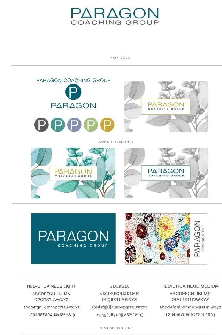
Logo Design & Brand Identity
This primary logo is shown in colors of the ocean, but when used in secondary placements, is suited for any of the brand colors. The strengths and straight lines in the logo are juxtaposed with images that are softer and lighter and allow for a more balanced palette.


