PARAGON COACHING GROUP
branding + website design
GROUNDWORK
The intent of this draft is to lay the groundwork for the final Brand Identity, print collateral and web design for Paragon Coaching Group. When the brand package is complete, it will include the primary logo. secondary logos, favicon, submarks, icons & patterns. It will include print collateral for business cards, stationery, envelopes, note cards, and two additional web or print collateral of your choice. Font pairings and color choices will also be included in your final package.
Your brand identity will drive your website design. Ultimately, your brand package will also include the web icons and assets used on the site, as well as any images used on the site.
ABOUT THE FOUNDER
Coleen McCray is an executive coach with a passion for developing emerging leaders and assisting seasoned leaders in path formation to their goals . Coleen’s envisions a new brand and website that is beautiful, encouraging and sophisticatedly genteel. We began by adopting the best elements of her current logo and language, and built an entirely new brand for her fresh new coaching practice.
Inspired by the colors of nature and the ocean, and the sense of well-being and calm that it evokes, Coleen wanted to infuse her brand with the colors and imagery that would reflect this. Working with predominantly professionals ages 30-60, Coleen needed a brand that would be inviting and elegant, yet still reflect an undated corporate vibe.
We began with a refresh of Coleen’s current logo, shown here. While this design is professional, graphically pleasing and expertly rendered, Coleen’s desire for a softer, lighter feel begged an update to this mark.

Coleen’s challenge is to first select the logo she she is drawn to, taking into consideration her ideal coaching role and her ideal client audience.. We expect that colors may shift slightly in the final design.

THE DESIGN PROCESS
I built three brand boards that each reflect Coleen’s goals in slightly different ways. These mood boards were hands-down some of my favorites to create! The color palette is calm and beautiful, utilizing hues inspired by nature and the ocean.
The colors, mostly in shades of blue and green, will add to calming and inviting feeling to the brand. Coleen also wanted her brand personality to be “bright and vibrant,” so we included a cheerful gold and a touch of jewel tones in some of the brand imaging.
To tie in the coaching theme, I chose images that felt like nature but included people living life. Keeping the brand fun and approachable, I made sure to included a scripted favicon to indicate my idea for font direction on the logo.
LOGO DESIGN + BRANDING BOARD #1
This primary logo is shown in colors of the ocean, but when used in secondary placements, is suited for any of the brand colors. The strengths and straight lines in the logo are juxtaposed with images that are softer and lighter and allow for a more balanced palette. The different images are samples of what is possible. Images in the mood board can also be substituted for the ones shown. Please rank the images you like most.

LOGO DESIGN + BRANDING BOARD #2
With this board, I’m suggesting a more rounded mark that might better convey your intent to be an encouraging and supportive coach. I love the way the lower case Helvetic Neue lettering works with the Paragon name. I also wanted to play with the letters to create a memorable logo that connects to the brand, so I created a custom monogram as a background watermark that can be used in numerous applications. The colorful submarks are great for branding images that might be used across social media platforms.


Once the decision is made on the logo direction, I’ll finalize the logo identity and create the most important print materials you will need for your June event.
LOGO DESIGN + BRANDING BOARD #3
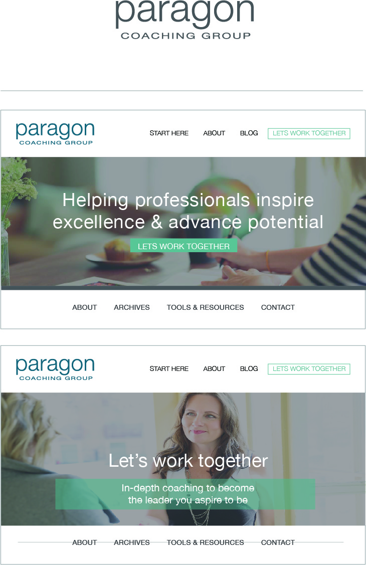
This board is suggesting how we might configure the website home page banner, along with a follow-up “Let’s Work Together” call to action page. The third image is a sample of a blog post image.
The goal of your website is to create a consistent look and feel on every page. This will help the visitor navigate and understand the information on each page with ease. I recommend as few words as possible on the primary pages, with the blog allowing for longer content. Studies show that primary pages are viewed for about 3-5 seconds each, and in that short time, we need to be clear and concise.